
July 7, 2025
Your Brand Colors and Your Market
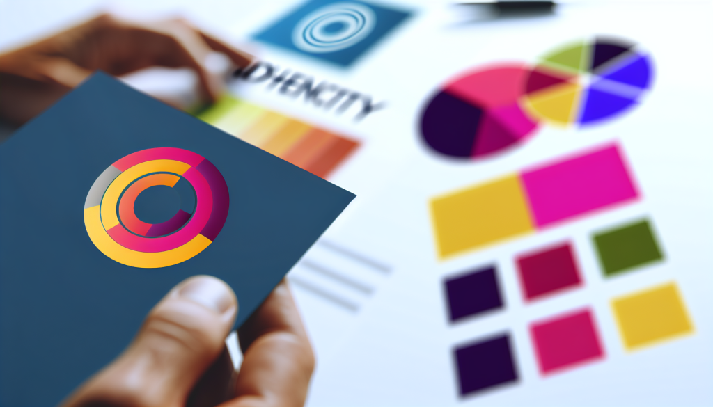
Your Brand, Your Colors, Your Message: How to Pick the Right Palette for Your Market
When Sarah launched her eco-friendly cleaning brand, she wanted to stand out. She had the formula, the packaging, and the mission—but something was missing. Her logo was a fiery red, bold and intense. But after six months, she noticed something strange: customers weren’t connecting with the brand. Sales plateaued. Feedback was lukewarm. Then a branding expert pointed out a critical flaw—her color choice was all wrong for her market.
Red, associated with urgency and excitement, clashed with her product’s promise of calm, clean, and natural living. She rebranded with soft greens and earthy neutrals. Within weeks, engagement and sales climbed. This is the power of color in branding.
The Psychology of Color in Branding
Color isn’t just decoration. It’s communication. According to a 2006 study titled Impact of Color on Marketing by Satyendra Singh, people make a subconscious judgment about a product within 90 seconds—and up to 90% of that judgment is based on color alone.
Color influences perception, builds trust, and guides consumer behavior. Choosing the right color palette is about aligning your brand’s values with the expectations of your market.
Let’s look at how different industries use color to send the right message.
Trust in Blue: Financial Institutions & Security
Industry: Banking, Insurance, Fintech
Common Colors: Blue, Navy, Gray
Psychological Effect: Trust, Stability, Dependability
Financial institutions thrive on trust. That’s why blue is the dominant color in this sector. Brands like Chase, PayPal, and American Express use shades of blue to communicate security and professionalism. A study by Colorcom found that blue is the most universally liked color and is often associated with logic and calm—an ideal fit for managing money.
Why It Works:
- Blue promotes feelings of confidence and safety.
- It appeals to a wide demographic.
- It softens the complexities of finance with a calming tone.
Bright & Bold: Recreation, Entertainment, and Fun
Industry: Theme Parks, Toys, Events, Travel
Common Colors: Red, Yellow, Orange, Purple
Psychological Effect: Excitement, Energy, Joy
In recreation industries, the goal is to energize and excite. Brands like LEGO, Nickelodeon, and Six Flags use bold, saturated colors that stimulate the senses. These hues increase heart rate and draw attention—perfect for fun-focused businesses.
Why It Works:
- Warm colors spark enthusiasm and creativity.
- They create a sense of urgency and movement.
- They appeal strongly to younger audiences and families.
Comfort in Neutrals: Home & Lifestyle Brands
Industry: Interior Design, Home Goods, Wellness
Common Colors: Beige, Sage Green, Soft Gray, Warm White
Psychological Effect: Calm, Comfort, Simplicity
Brands in the home and lifestyle space often rely on neutral, earthy tones. Think of brands like IKEA, The Citizenry, or Magnolia. Their palettes use natural colors to evoke a sense of peace and simplicity.
According to a 2018 study in Color Research & Application, soft neutrals promote relaxation and are associated with mindfulness and wellness—perfect for home environments.
Why It Works:
- These colors evoke stability and serenity.
- They don’t overwhelm and allow the product to shine.
- They reflect current trends in minimalism and sustainability.
Choosing Your Brand Colors: A Practical Guide
1. Know Your Audience: What emotions do you want your customers to feel? Excited? Safe? Relaxed?
2. Study Your Competitors: What colors dominate your industry? Do you want to align or differentiate?
3. Use Color Psychology: Choose colors that align with the emotional tone of your brand.
4. Stay Consistent: Apply your palette across all branding materials—from your website to your packaging.
5. Test and Adapt: Use A/B testing to see how different colors perform in real scenarios.
Color Palettes in Action: Real-World Examples
| Industry | Brand | Primary Colors | Message Sent |
|---|---|---|---|
| Finance | PayPal | Blue, White | Trust, Professionalism |
| Entertainment | Netflix | Red, Black | Drama, Intensity |
| Travel | Southwest Airlines | Blue, Red, Yellow | Energy, Safety, Warmth |
| Home Goods | IKEA | Blue, Yellow | Reliability, Affordability |
| Wellness | Calm | Soft Blue, White | Peace, Clarity |
Conclusion: Color Is Your Silent Ambassador
Every color you choose speaks before your brand ever says a word. Aligning your brand colors with your market’s expectations builds trust, fosters emotion, and drives engagement. Whether you’re selling insurance or surfboards, your palette should be as strategic as your product.
Remember Sarah and her red labels? Her brand didn’t change—just her colors did. And that made all the difference.
Further Reading & Resources
Insight into how color influences consumer behavior and purchasing decisions.
Breaks down color meanings and their impact on branding with real-world examples.
Peer-reviewed studies on the science of color and its applications in design.
Tool for building and testing color palettes for branding and design.